Enterprise software is too big, too complicated, too complex for customers to know exactly what they’re getting. No matter how much we progress in making software observable, trialable, and easier to use, the scope of testing in exactly the customers’ environment is always limited.
CUSTOMERS BUY SOFTWARE, BUT THEY’RE SOLD PROMISES
Customers buy software, but they’re sold promises. Promises the vendor will advance the circumstances the customer seeks to accomplish.
When vendors harp on about the importance of presentation and professionalism, when we hear about the need for brand consistency, they’re talking about the promise. Everyone who talks to customers is part of the promise. All sales material is part of the promise. Every webinar, seminar, conference, and user summit are part of the promise.
If you put into words, what’s your promise to your customers?
It doesn’t matter if your software is amazing, no one wants to buy what you’re selling. Customers don’t care what features it has, not really. They care what it can do for them.
It’s not until you really spend time with customers that you can find that magical “market fit” and understand the difference between what you need to sell and what they want to buy.
Ted Levitt and Seth Godin said it better than I ever will:
“No one buys a quarter-inch drill bit because they need a quarter-inch drill bit. What they need is a quarter-inch hole. That’s what you should sell them.”…What would you possibly need a quarter-inch hole for? What you need is a place to put the expansion bolt so you can put a screw in the wall.
But actually, you don’t need that. What you need is to put the shelf on the wall. But you don’t really need that.
What you need is a place to put the books that are cluttering your bedroom. But you don’t even really need that. What you need is the way you will feel when your spouse thanks you for cleaning things up. What you really need are safety and security and a feeling that you did something that was important.
We get lost in love of the idea that our ever expanding market of more affluent customers will guarantee our revenue growth. As a result, we focus on the wrong thing: products over customers. Remember, even when growth stalls, you may have an unbelievable base to build from.
Myth #2 – There is no substitute for our industry’s major product
This makes us vulnerable to innovation from outside our industry. We own the infrastructure. We own the expertise. We own the customers. But, when we fail to innovate others will.
Myth #3 – We can own the market through mass production
With high fixed costs, and comparatively low variable costs, software has enviable margins. But, this puts the focus on selling what you have. It encourages you to tell people what they want, not listen to what they need.
The remedy for this is really understanding what business you’re in. Are you selling rail capacity arbitrage, or transportation?
The impulse to focus on R&D makes perfect sense. It’s probably the roots of how you became successful. It’s something you can control. And, besides it’s fun to solve hard technical problems. But…
“Consumers are unpredictable, varied, fickle, stupid, shortsighted, stubborn, and generally bothersome.”
Levitt
Customer’s don’t care about any of the reasons it makes sense to rely on R&D. They rely on you to help solve their needs. If you can’t solve their needs, they’ll find someone else. If you don’t know their needs, good luck solving them.
When you customize software, you create more unique risk, and remove yourself from the pool of shared risk.
Shared risk is good, as there’s a good chance someone else might encounter a problem before you, and collectively you can encourage the vendor to fix it.
Selective unique risk is good because it can be a matter or method of differentiation for your organization. But unique risk, in enterprise software, is asymmetric.
Enterprise software is complex. You make a small change here and you see a large change there. You see changes in unexpected places, and in conditions which would have been perfectly normal before the change. When you customize software, you create new business impacting edge cases that no one else cares about.
So, if and when you decide to customize your software, remove yourself from the shared risk pool and create unique risk, make sure it’s damn well worth it.
I wrote this some while back during my eighth week using Todoist as my task tracking software. Every time I pick up a new one, I start over with what I remember from half-heartedly working through David Allen’s Getting Things Done methodology.
It just happens that about four weeks into using Todoist, I started reading the new edition of Allen’s book, and getting back into the habit of using the system. This time, after starting GTD again for the umpteenth time, I wanted to test whether or not I was actually getting more done. At the same time, I’ve a renewed interest in control charts as I caught up on my reading on Deming.
Control charts help measure whether a process is stable. If I look at the number of tasks I complete each day, grouped by week, and how much I get done is about the same week to week, then I have stable output. One of the nice things about control charts is the explicit built in understanding of variability. This helps, because for me, no two days are alike for me, but week-to-week shouldn’t be too different. There may very well be better statistical tools for this task, but I wanted to learn more about control charts and possible application to personal output.
I’m using three different control charts to look at the number of tasks completed everyday (grouped by week), the range of daily tasks (max – min) completed in a week, and the proportion of days that fall outside the expected upper and lower bounds of daily tasks complete.
These upper and lower bounds are calculated, so we need an initial sample set to compare against. Since what I’d really like to know is whether there is a difference in my productivity once I’ve started embracing GTD. In order to do this, I needed before and after data, which I was able to get through the Todoist API.
I have about 3.5 weeks of use of Todoist before getting back onto the GTD bandwagon, so I used the first four weeks as the baseline. You’ll see a dashed vertical line a reminder of four weeks as the before and after mark. We’ll talk through the output of the control graphs from top to bottom.
example control charts
Top Chart – Task Completed per Day
Our top chart is the number of tasks accomplished on any given day, grouped in order by week. The solid gray lines represent the calculated upper and lower bounds of the range of the number of tasks I should expect to complete on any day. In control charts, these are called the Upper Control Line (UCL) and Lower Control Line (LCL).
Each of the gray and red dots represents the number of tasks completed in a day of that week. The marks are gray if they fall between the LCL and UCL, and are red if they are outside of them (greater than or less than respectively). I have enough variability in what I accomplish that the LCL is pretty low, so it would have to be a pretty slow day to not exceed it.
The shape of the dots represent whether the portion of the days where tasks complete fall outside of the UCL/LCL range exceeds what’s expected. More on this when we talk about the bottom chart.
The middle dashed line is the average number of tasks across those first four weeks.
The blue line is the average number of tasks for each given week.
What’s My Read of the Top Chart?
Following the pattern of the blue average line, It sure looks to me like my average weekly productivity has increased since implementing GTD. From the number of red dots, I also have more days that exceed the UCL than before, including two consecutive weeks (out of three) with two outstanding days, versus the average of one.
Middle Chart – Range of Tasks Completed per Week
Each point on this chart represents, for the given week, the most tasks completed in a day minus the least tasks completed in a day.
The solid gray lines, like in the top chart, represent the UCL and LCL. Similarly, the dashed horizontal line is the average for the first four weeks, and the dashed vertical line is our before/after demarcation reminder.
What’s My Read of the Middle Chart?
My first full week using GTD, week 5, shows a really big jump in the range. If you look at the top chart for the same week, you can see this is due to one ridiculously task driven day. My calendar doesn’t show anything unusual for the day, but this is the first Monday using GTD after I began the book on the Friday before. I’ll chalk it up to enthusiasm.
The following week, the range decreases a bit, while the average still goes up (top chart). So while the average productivity is still influenced by extremes (here two instead of one), we are seeing a swing closer to average. I’m not sure whether this is increased productivity, or a fluke, but I’d like to see better results due to the process, not from enthusiasm and energy of something new. I hope that what we’re beginning to see.
Oh, and that red mark in week 8, that’s because I only have one day of data. Max – Min = 0, when they’re both the same day.
Bottom Chart – Days Outside the Predicted Range of Completed Tasks by Week
Even when a process is stable, there can still be errors: errors outside of specifications and errors outside of the UCL/LCL. I think this chart is supposed to be errors outside of specification, but since I have no idea what I’d like my spec for productivity to be, I’m using the UCL/LCL in the tasks completed (top chart).
What’s My Read of the Bottom Chart?
I don’t get much more from this chart than discussed in the top chart, but what I’m looking for is more days that exceed the UCL than average. Typically, it’s one day a week. Since starting GTD, I’ve had a couple of high weeks. Let’s hope that’s the beginning of a trend.
Conclusions
While there are a lot of assumptions going into this, like: weeks are similar even when days aren’t, and I’m similarly recording the actions I complete. But, as I use this over a longer period of time, those won’t matter so much.
It’s a fun exercise, but you need a lot of data to get started. I’m glad Todoist has the API, and it looks like I’m off to a promising start on getting more done.
Every vendor offering you a cloud product touts their ability to provide agility to your IT organization. But, how do you place a value on agility in order to prioritize IT projects? There are a number of economic tools that come up frequently in describing value of software investments. I favor a simple economic approach: Net Present Value (NPV).
Net Present Value is the sum of value provided over time, discounted for the cost of money you’re investing in order to reap that value, e.g. interest. As an IT leader, you may not carry the cost of interest in your budget, but your Line of Business customers are likely affected by it and alignment makes for good partners. Let’s walk through an example.
Once upon a time, Red Hat acquired a company called Ansible. Right before the transaction closed, The Boss called and said, “Erich, I want you to make Ansible part of Red Hat. Don’t @#$% it up.” That’s when my real adventure with automation began.
Ok, the tech is nearly as amazing as the people, but how did it fit into our business? To really get this right, I spent a lot of time learning about the why’s of automation – what’s is really good for, and how it changes work.
Four goals of automation
Do more of the things
Do the things with greater consistency
Do the things cheaper
Less training to do the things
I suspect there might not be a lot of surprise in that list. Once it’s written down or said aloud, it seems pretty intuitive. What I’ve found interesting about, and unique to Ansible, is how much our design principle of “simple” makes all four better. Simple lets you get started faster on new things (less training), and takes less time and lets you do more things. Simple means fewer mistakes (consistency), and all of these together lead to less expensive operations.
But, what about how automation changes work? At the first pass, those four goals are big changes to work in of themselves. But, the biggest impact comes when things change.
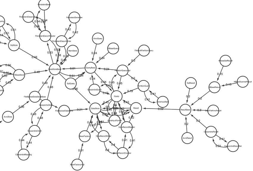
Systems are Complex. Snippet of Apache Gora project represented by Chong and Lee (2015a)
Here’s an unpopular truth, if you work with systems of any size, you don’t know exactly how they work. If you’re diligent, you may have a great idea how they work. If you’ve worked with them long enough, you have a great intuition of how they work. You might know how to look up how a particular subsystem works, or who to call when another isn’t performing as desired. But you don’t, with precision, know.
That matters because it also means you don’t know all of the assumptions that lead your processes to work. Automation can break in at least three cases:
Inputs change
Conditions change
Things break
Consumption and use of a robust automation system, one which holds up in light of these expected changes, requires both the users and the technology to absorb these changes.
We can still do more things, but the volume of things can overwhelm when something breaks. Operator workload can become lumpy and unevenly distributed, especially at peak times, we introduce cognitive overload with new metrics, and other changes to the work itself.
The things we automate become more precise, but we see new types of errors emerge: system errors, unmet requirements/edge cases, more complex behaviors to manage.
Things are less expensive at the unit cost, pure replacement with automation is doesn’t happen, and is referred to as the “substitution myth.” Automation changes work.
Things are easier to do, and require less training. But, there’s an increased need for ongoing training, need to know the system as well as the components, with more emphasis on the system.
There are two approaches for creating more robust systems: handle as many edge cases as possible, which introduces more complexity to the system and makes it harder to fix the edge cases you missed; and simplicity. We chose simplicity.
We chose simple to help the teams understand the systems they’re using. When something breaks, they know where to look, and have a shared language to work with others impacted by the systems.
We chose simple to lower the expertise and effort to get started, creating more opportunity to automate little things in a learning, incremental approach to building hyper-scale automation systems.
I have an iPhone 6. It is not a happy phone. It is sad, angry, and generally disappointed to still be in commission and yearns to be put out on a ice flow. It generally expresses its displeasure by passive aggressively inventing remaining battery percentage, rebooting at whim, and pretending storage is full.
So, long preamble over, I was out for a jog this weekend. An embarrassingly rare occasion, and one I take to listen to podcasts. This run’s selection was the Dave and Gunnar Show with Bob St. Clair. And it was great! I was full of thoughtful humility, and smart dogged drive to be better at that ugly transition from individual contributor to leader of leaders. I’m a big fan of the show any way, and this was an exceptional episode. I’m glad I get to work with these three, even if we rarely cross paths. Thank you.
Needless to say, my phone crapped out just as I turned for the run back home.
Should you ever have to repair a 1950-something Crown Range, they’ve done something smart. I had to figure it out, but it’s smart.
Philips head screws are for holding things together (like sides the over doors), and slotted screws are for attaching things onto other things (like hinges). They provided a clear visual signal about what things did. Makes me feel like whomever came up with this idea would have enjoyed data visualization.
And yes, I now have two working over door handles.
A couple of years ago, Massimo Ferrari and I created the most extensive and thorough financial evaluation of OpenStack, which we called Elephant in the Room. We talked about it a lot, met a lot of customers doing amazing things, and received a lot of nice press coverage. Pulling together this type of research is a lot of work, and the hope was it would do more than help a few customers. The hope was it would help change the conversation we, as an industry, are having around cloud. That’s ambitious, I know, but I’m an optimist and was convinced we needed more understanding of financial implications of our technology choices.
Using some quick R¹ for statistical testing on the results of search phrase “cloud tco” on Google Trends, there is a sustained 42% increase in that search phrase following our blog post. I don’t know whether our blog post and talks around the world caused it, but the stats are significant (p << 0.01), and it sure is a heck of a coincidence.