Having your own cloud does not mean you are out of the resource planning business, but it does make the job a lot easier. If you collect the right data, with the application of some well understood statistical practices, you can break the work down into two different tasks: supporting workload volatility and resource planning.
If the usage of our applications was changing in a predictable fashion, resource planning would be easy. But that’s not always the case, and volatility can make it very difficult to tell what is a short term change and what is part of a long term trend. Here are some steps to help you prioritize systems for consolidation, get ahead of future capacity problems, and understand long term trends to assist in purchasing behaviors. Our example is with data extracted from Red Hat’s ManageIQ cloud management software.
Usually, we collect and see our performance over X periods of time, where X is a small number and we don’t get much insight. More data points are help, but require a lot of storage. ManageIQ natively provides data rollup of metrics, to provide a great balance between the two. Since we want to compare short term to long term for trends, we lose little using the rollup data.
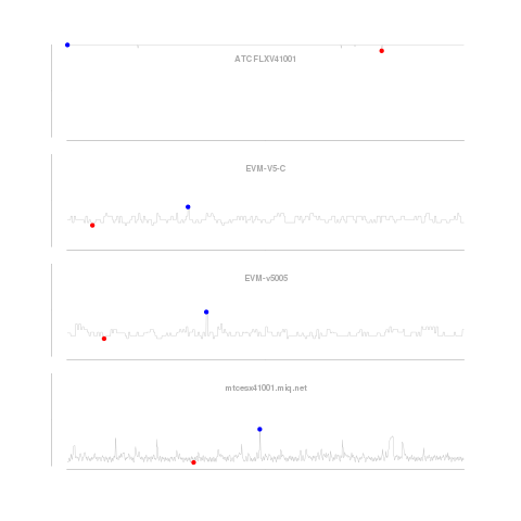 Our graphs look at the CPU utilization history of four systems. The first graph looks only at the short term data, smoothed (using a process similar to the one described here) over one minute intervals. We smooth the data to reduce the impact of intra-period volatility on our predictions. The method described corrects for “seasonality” within the periods, e.g. CPU utilization on Mondays could be predictably higher than on Tuesdays as customers come back to work and get things done they could not over the weekend. The blue dot is the highest utilization, and red, the lowest over the period.
From this first graph of short term utilization, we learn little except the first server is pegged, which we would have been able to figure out from any alerting service or solution we use. Not very interesting.
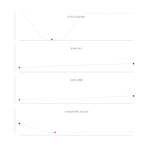 Next, we look at longer term data smoothed over weekly usage. Looks like the server at the top of the graph has been pegged for a long time. Not much here, but the middle two show a distinct increase in average utilization over time. They are well under 100% utilization, but good servers to keep an eye on for future offload and load balancing candidates. The fourth, and bottom, server for which we saw low but highly volatile utilization over the one minute intervals, we see a gentle rise in utilization. It’s tough to see, but we know this as the low utilization mark is not at the end.
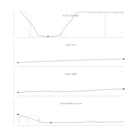 To compare these trends with the data, we add back in the “unsmoothed” data. I would probably generally use this one over the just the trend, as a subtle reminder that the trend is a model, and not the actual data.
Finally, since we have the data and the seasonalites already calculated, we can do some predictions of expected CPU utilization taking into account the regular and changing patterns within a “season.”
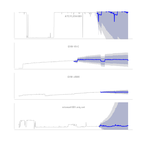 This graph shows the same unsmoothed data we see in the background of our third graph, and adds a prediction of the utilization in the future (blue line). Surrounding it, are the 80% (dark gray) and 95% (light gray) confidence intervals.
The blue line indicates where the model suggests the utilization will be, but like many good models we explicitly acknowledge the model is the center of a range of expected outcomes. The 95% interval indicates the expected outcome from the prediction model will fall within that range 95% of the time. What do we learn from our model and data?
The top server has a strong seasonality (the noticeable downward trend, with a sharp drop before jumping back up), but the volatility is too great to have a useful estimation of the expected load. All we know is this server is overloaded, and has regular changes to its very high utilization over the course of the week. Even a great model doesn’t help all the time.
For the second and third servers, we see a striking difference in the confidence levels despite similar slowly increasing utilization. The second server (EVM-V5C) has a higher intra-period volatility and is more likely to dramatically increase or decrease. If you are looking to consolidate workloads, the second is a better bet with its more predictable CPU utilization.
For our bottom server, we see some interesting results. Despite the low utilization, and low growth rate, there is very high volatility. This high volatility could change this lightly loaded server to full CPU utilization in a short matter of time. Keep your eye on it.
After breaking down our historical data into three elements: long term trends, repeated seasonality, and intra-season variation (jitter); we looked at each. Long term trends help guide resource planning (when do I have to buy new servers?). Seasonality lets you predictably scale for period fluctuations within the day, week, month, year, etc. Jitter is the hard part.
Jitter is the unpredictable unaccounted for in our model. But, even though it doesn’t fit, we can still use it to prioritize servers for consolidation and which deserve extra attention as they may become a problem in the future.