I want to know how to characterize my workloads in the cloud. With that, I should be able to find systems both over-provisioned and resource starved to aid in right-sizing and capacity planning. CloudForms by Red Hat can do these at the system level, which is where you would most likely take any actions, but I want to see if there’s any additional value in understanding at the aggregate level. 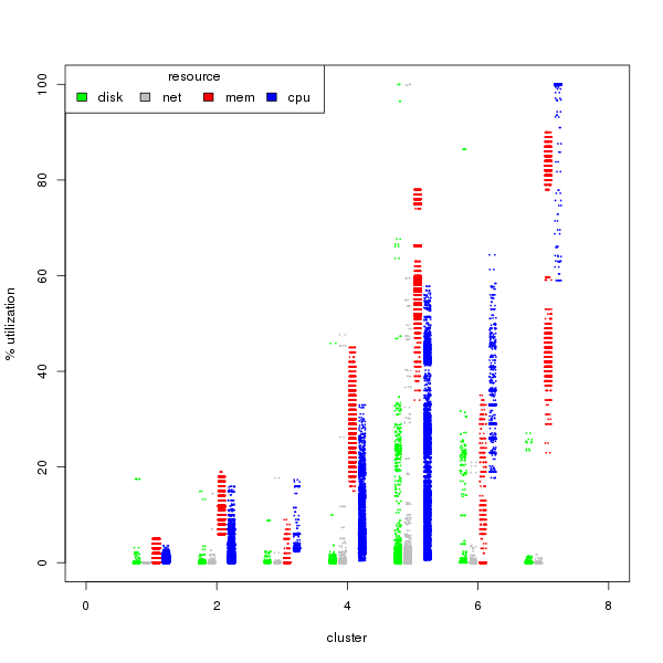 We’ll work backwards for the impatient. I found 7 unique workload types by creating clusters of cpu, mem, disk, and network use through k-means of the short-term data from CloudForms (see the RGB/Gray graph nearby). The cluster numbers are arbitrary, but ordered by median cpu usage from least to most.
From left to right, rough characterizations of the clusters are:
- idle
- light use, memory driven
- light use, cpu driven
- moderate use
- moderate-high everything
- high cpu, moderate mem, high disk
- cpu bound, very high memory
 Each of those points represents one of the ~68,000 time slices I have in my sample with all four of the resources measured, come from 50 servers. The data points are not segregated by workload type, not server.
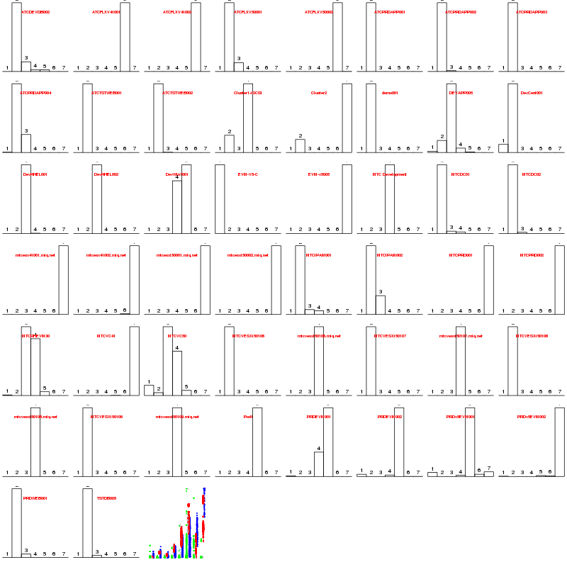
To check whether individual servers were stable within these workload types, or bounced around, we can look at the distribution of amount of time each workload spent in each “cluster.” The rainbow at the end is a repeat of the first graph for a visual reminder of which cluster is which.
With only a few exceptions, they look stable in their cluster. This suggests the servers spending most of their time in 1, 2, or 3 can see a large consolidation without much conflict. Cluster 4 can be added into the mix, but with more care. Clusters 5 and 6 have heavy I/O patterns and should be separated or use other methods to isolate the I/O channels. The high mem, high cpu seen in cluster 7 suggests an efficient bound on resources, with the possible exception of looking to additional CPU power. The next question is whether there are enough servers of cluster 1, 2, 3, and maybe 4, workload patterns to make a dent if we consolidate.
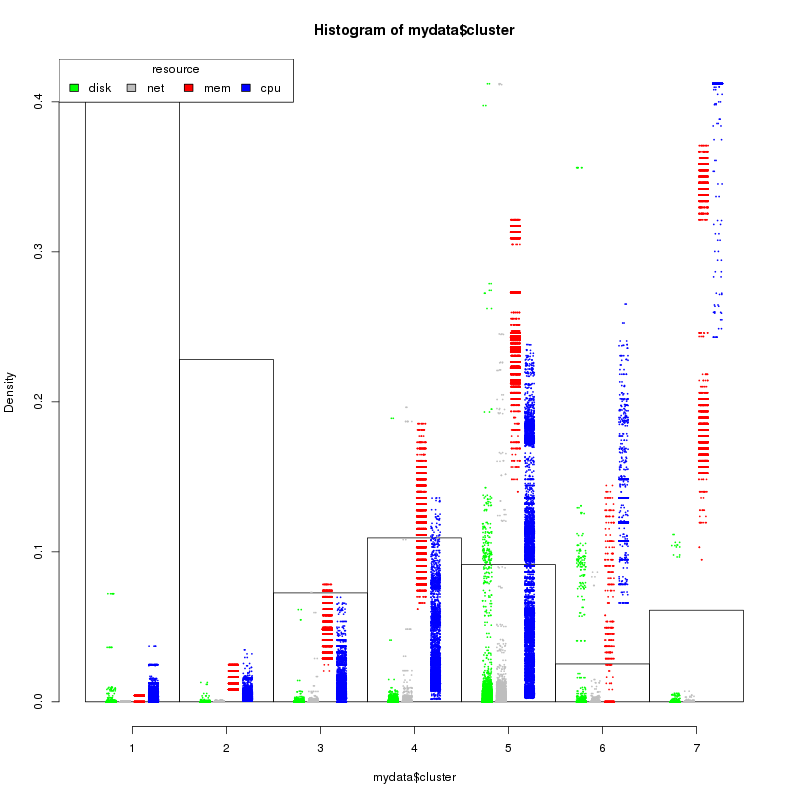 To test this we can create a quick plot of the distribution of the resources by cluster type. I’ve created this and overlaid the cluster patterns for a visual reminder of the type. Density, on the Y axis, is the percentage of servers that fall into the category. From the chart, we have ~65% (let’s say 33 of 50) of our work loads that can tripled up or better.
What’s hard about this?
Comparing CPU and memory are easy, as are network and disk. They are both in the same scale (% and bytes respectively), but between the two groups is hard. I ended up normalizing the network and disk throughputs to the same 0-100 scale by dividing each by the maximum value and multiplying by 100. That gives us the same scale, but we also see very different distributions. Percent utilization of CPU and memory do not seem to change rapidly. With both disk and network, we see discontiguous low use, medium use, and occasional very high use. Dividing by standard distributions showed the same problem. Recommendations requested for better ways to get all four to the same scale.
Data size for cloud-scale quantity of hosts could also be difficult. Memory size was ~580 bytes per record, easy for this size sample. If that holds at scale we’re looking at ~17GB for one week of data for 1,000 hosts. Might take some fancy work to get that to work on a laptop, but easy on [insert your favorite public or private cloud here].
The data was collected using the same tools as described in previous post Load Volatility and Resource Planning for your Cloud and the code will be updated on github.
[…] document.getElementById('singlemouse').style.display = ''; } SLAs and compliance in the cloudDetermining Application Performance Profiles in the Cloud .recentcomments a{display:inline !important;padding:0 !important;margin:0 […]